This blog post originally appeared on the Natural Resources Canada internal blog, Digi-Get-It, in 2016.
Mobile vs. Desktop: What’s the Difference?
By Jenn Burke
For this inaugural post of Digi-Get-It, the new Digital Communications blog, I wanted to focus on an element of 21st-century society that’s having a huge impact on how we communicate: mobile devices.
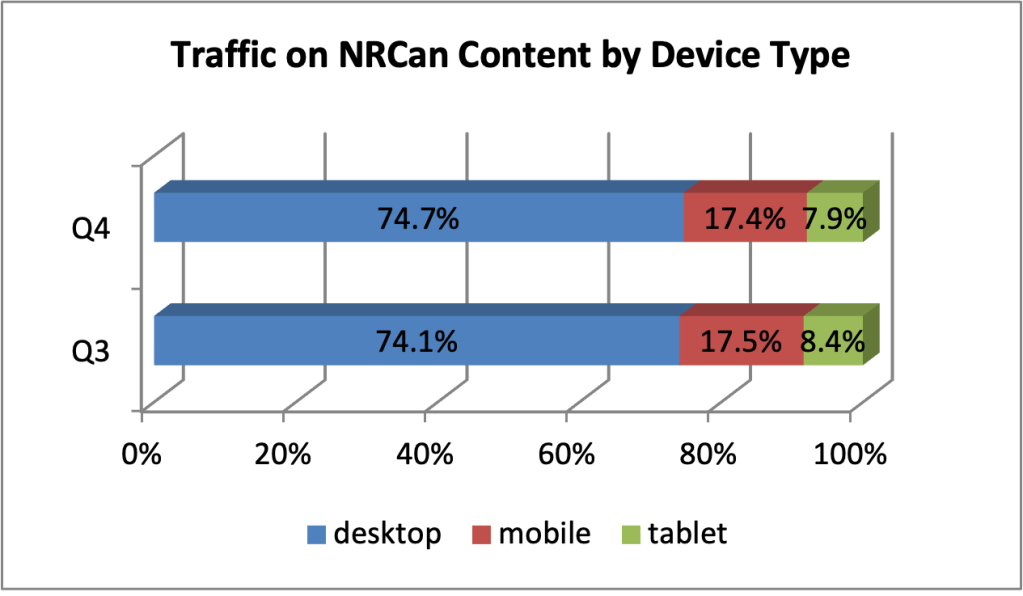
Mobile usage of NRCan’s web content continues to increase. From 22% in 2014-2015, mobile users accounted for 27% of visits to our site in 2015-2016.
It’s a big shift in how we think about communicating.
As the web has evolved, we’ve come to understand how people use it. The last 20 years of Government of Canada (GC) websites have been a never-ending educational process, particularly with the introduction of mobile devices and their effect on how people use the web.
According to a 2015 study by Catalyst.ca, about 68% of Canadians have a smartphone. That’s approximately 24 million people.
Anecdotally, a lot of us rarely use our phones as phones—that is, to talk to someone. We check email, we text, we even watch TV shows. We can access almost any information we want with these little computers. We don’t have to be sitting at a desk, in front of a computer—we can be anywhere.
So what does this mean for GC web content?
Some of the work to make our sites mobile-friendly has already been done. For example, the Web Experience Toolkit template most GC sites use (including NRCan) has been designed to react to the size of the users’ screen. (You can test this out by going to NRCan.gc.ca and shrinking your browser window to smaller sizes.)
However, our work isn’t done yet. As we create content, we need to remember some essential characteristics of mobile device users:
- They are viewing the site on a smaller screen.
- They are looking for specific information to complete a specific task, not browsing.
- They may not be able to devote their full attention to their task.
- They face a greater chance of interruptions.
Essential steps to creating mobile-first web content
- Follow good web writing best practices. Our web writing guide is a good start, or contact me about my next web writing tutorial.
- Provide links that are longer than one word. Using text like “click here” is not a very good practice for accessibility and usability reasons anyway, but it’s also difficult for a mobile user to select a link of that tiny size with their fingertip.
- Provide “next step” links in the content. The left navigation is often hidden from view on mobile devices, so don’t rely on it to guide mobile users to the next step.
- Remember that mobile screens are small. In order to view the same information that’s available at a glance on a 30-inch monitor, a mobile user will have to scroll through at least five screens. Put the most important content—the reason the page exists—first.
- PDFs are not mobile friendly. There are some instances where accessible PDFs are the ideal solution—such as for a multi-page scientific report. But for a one-page fact sheet, for example, it’s better to code it in HTML.
- Mobile users have to watch their data consumption. Data plans in Canada are expensive. You don’t want to burn up users’ data plans with excessive use of images or other large file formats.
Digi-Get-It: Digital Communications in a Digital World is a new blog dedicated to sharing best practices, tips and tricks, guidance and news about digital communications topics and how they relate to NRCan’s web and social media presence.
If you have any feedback about this week’s post, please feel free to leave a comment or send me an email. I’m always happy to discuss the topics of web writing, web usability and web analytics. I’m eager to hear if you find these posts useful and helpful as we move toward a digital communications future in the Government of Canada.
Thanks for reading!
 Jennifer Burke